upSpring.io aims to make EDI easy for growing businesses. They ensure that their clients’ technology “talks” to their partners. We’ve helped develop their visual identity system, website and provide ongoing support with their social media and other communications.
CUSTOM ILLUSTRATION
DIGITAL REPORTS
INFOGRAPHICS
LOGO
STATIONERY
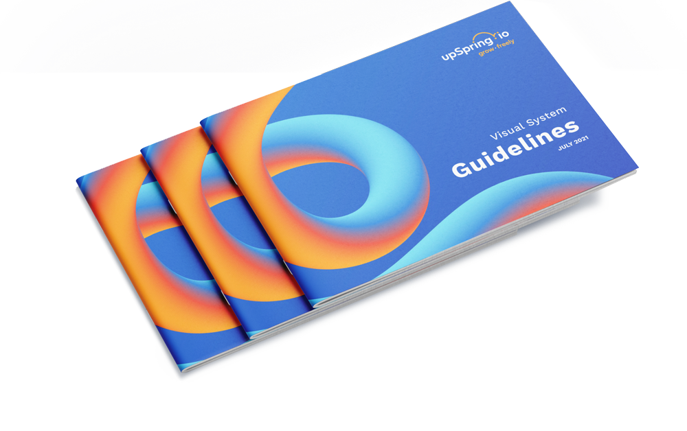
VISUAL IDENTITY GUIDELINES
WEBSITE
SOCIAL MEDIA GRAPHICS
Visual Identity
THE GOAL //
Create a unique visual system that feels modern and energetic. The brand should reflect what they do best—their packages that help make EDI feel easy and approachable.
OUR SOLUTION //
A big personality.
Using simple shapes and expressive lines, we created a logo and visual system that captures the essence of upSpring.io. The logo literally connects the dots, alluding to the work that upSpring.io does—making connections. The abstract and fluid shapes in the illustrative elements gives this identity a distinct look and feel.
THE PROCESS //
Letting the essence guide our way.
We worked in collaboration to create the company name, tagline, and package names—all with the concept of making the complexities of EDI easily understood.
With this essence guiding us along the way, we explored various visual expressions that conceptually aligned. It helped inform the design of the logo, visual assets and brand guidelines.
SUCCESS //
A unique and impactful identity.
The final look and feel is fresh and energetic. It stands apart from the competitors in this space, and lends itself well to feeling approachable to prospective clients.