Goodluck 13 is a trilingual strategic communications consultancy providing fractional leadership, crisis communications, and ethical storytelling support to mission-driven organizations. Led by senior strategist (and long-time collaborator) Tracie LeBlanc, whose 20+ years of experience shape the studio’s strategic and values-driven approach.
LOGO
PRESENTATIONS
VISUAL IDENTITY GUIDELINES
WEBSITE
Goodluck 13 logo, visual identity and website
THE GOAL //
When Tracie made the decision to launch her own consultancy, she came to Fusion to build a visual identity that reflected her personality and expertise. Goodluck 13 needed represented her as a seasoned strategic communications leader—confident, clear, and values-driven—while honouring the personal story behind the name.
OUR SOLUTION //
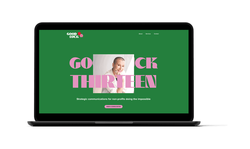
We leaned into the story.
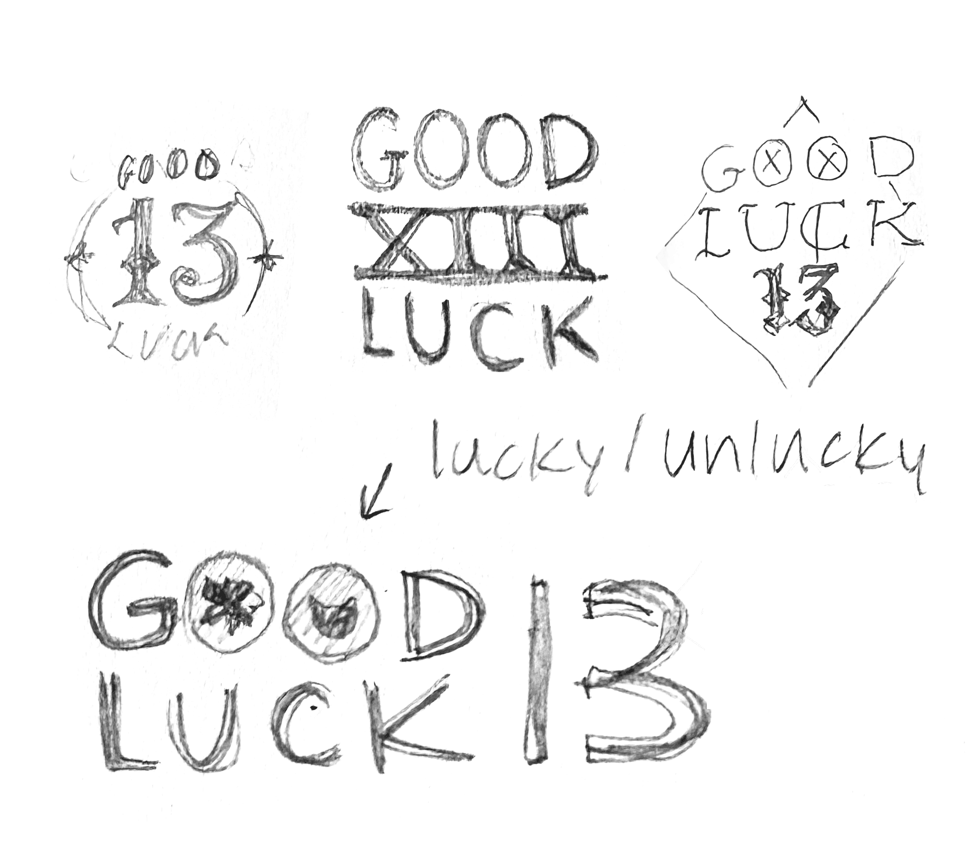
“13” is often considered unlucky. Tracie sees it differently. For her, luck is something you forge through courage, clarity, and action. That reframing became the strategic foundation of the identity, turning superstition on its head and owning the narrative. The name is deeply personal, a reflection of her long-held philosophy and sense of identity. In Spanish, Tracie goes by “Trece” (thirteen) a number she has embraced for years, even marking it with a Lucky 13 tattoo. We explored inspiration from traditional tattoo iconography—bold linework, strong shapes, iconic symbolism—as a nod to that history. The result is unapologetically bold, not what you might expect from a traditional consultancy, but unmistakably Tracie. Distinctive, confident, and strategically grounded.
THE PROCESS //
Room to go bold.
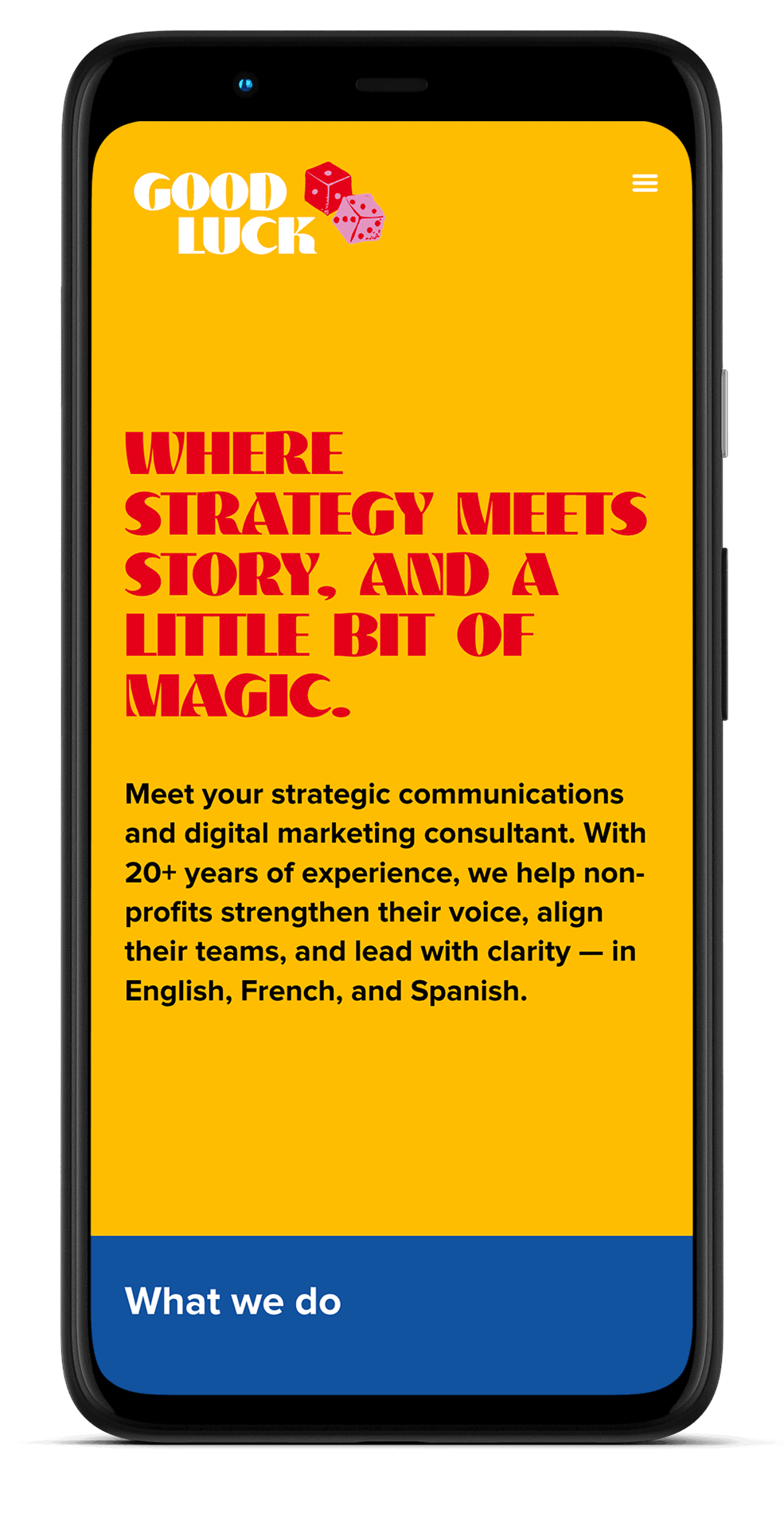
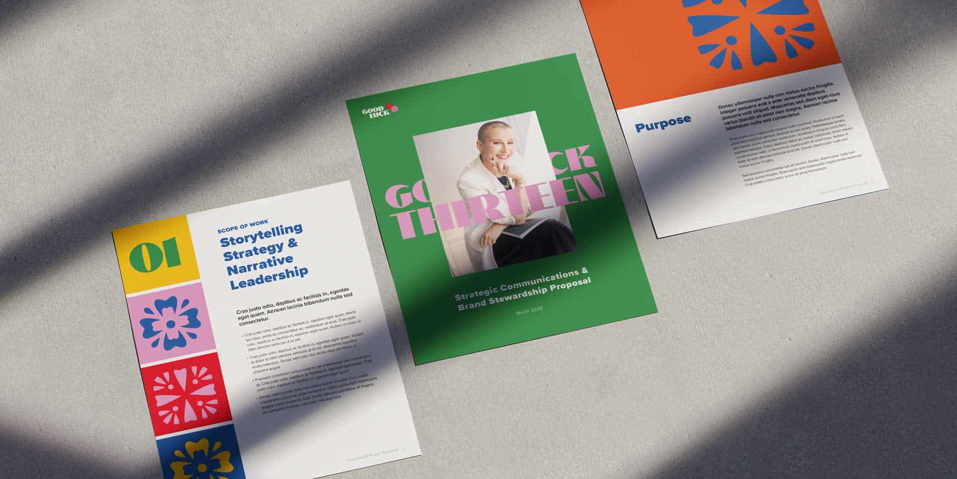
We’ve worked alongside Tracie for years—across teams, campaigns, and numerous communications projects. We understand how she thinks, how she leads, and how she shows up. When she launched her new business, with just her name and a temporary site, she chose not to rush the visuals. Instead, she trusted the process, giving us room to explore, push, and develop the Goodluck 13 identity thoughtfully. We began with logo exploration, examining the idea of luck and the symbols that represent it. From there, we built a bold colour palette inspired by imagery she shared—vibrant, confident, unapologetic. Tracie often challenges teams to “go bold.” Her own brand needed to be held to that same standard.
SUCCESS //
Luck, redefined.
Tracie secured a contract within the first week of launching on her own—a testament to her expertise and reputation. Since then, Goodluck13 has continued to grow, recently expanding to include freelance support. The visual identity anchors that growth with confidence and consistency. More importantly, the identity feels aligned. It represents both who she is and the strategic depth she brings to her clients.