


Earlier this month when Apple announced their new Liquid Glass effect it felt like everyone was racing to get their opinion online before someone else said it first. In the end, the controversy led to an expected marketing boost. Whether the audience is talking about how much they love or hate the new design, the real win is that they’re talking about it.
Not every company has the (almost) blind brand loyalty that Apple has, and keeping up with trends while staying committed to brand standards can be challenging. Internally we often talk about how our designs can (and should) maintain a family resemblance. A brand isn’t a cartoon wearing the same outfit every day, it needs to be alive with personality, and flexible to the company’s day to day needs.
A family resemblance allows you to adapt to the needs of each project, while also maintaining engagement and excitement with your audience. But how do you know if you’ve gone too far? When does the brand go from looking like a sibling to a third cousin once removed?
Your new design looks like everyone else’s.
It’s great to pull inspiration from what other designers are putting out into the world, but if you look at your design and see another’s work staring back, you’ve gone too far. I personally like to take my inspiration from sectors that have no relation to the work I’m doing at the time. This forces me to assess what I like and what I’m trying to achieve without inadvertently copying someone else.

Your brand system is overly complicated.
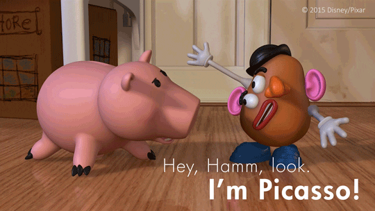
It’s important that the foundation of your visual system is more than just a logo and a typeface, but you also don’t want to have too many elements and no sense of unity. Great brand systems know how to walk the line, providing just enough structure to allow room for “play”, but not so few guidelines that the system ends up looking like Mr. Potatohead.
Your new look doesn’t match your industry—or your audience.
Just because something is trending doesn’t mean that you should adopt it into what you’re doing with your own brand. Just because Apple is going ultra-modern with their liquid glass doesn’t mean that Hello Fresh should do the same. One is a tech company showing they’re at the forefront of technology, the other is trying to get good food into people’s homes — they’re not going to look the same, and that’s ok.
Internal teams avoid using the new assets.
Everyone has their own ideas about what makes “the brand” naturally achieve that family resemblance. If you launch a re-fresh and you’re finding resistance to the adoption of it, you’ve probably wandered too far away from the heart of who you are. This is why a gradual evolution to your visual assets can lead to more successful results.
As you’re allowing your brand to evolve, it’s smart to conduct an audit once a year, this way you can see how your visual system is progressing. With this approach you can shed light on where things maybe went too far, or not far enough, and what ideas are working as great additions to your toolkit. This routine gives your brand permission to grow. Without growth, we risk stagnation, missed opportunities, and falling behind in a constantly changing world.
