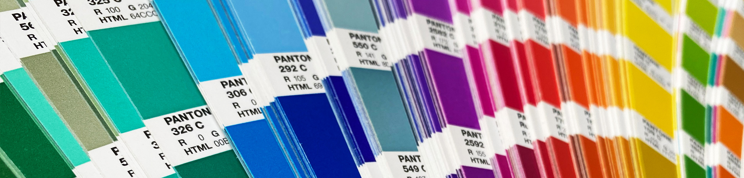
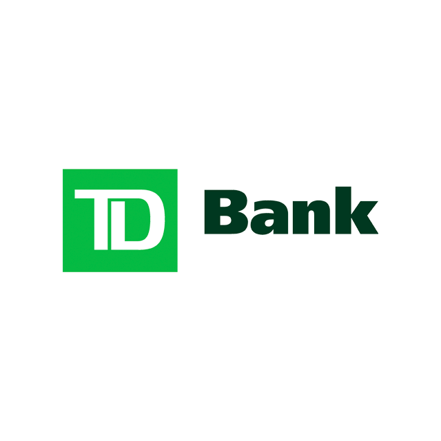
I’m sure everyone can relate to the experience of looking at something, and thinking “oh, that feels stuffy” or “that poster is loud!”. That’s the power of colour at work. Humans attach meaning to different colours—those meanings can overlap and depend on context—but it’s one way we use colour to help convey a message or elicit a response from the audience. Ever notice that there’s a lot of banks and financial institutions that use the colour green (as in money and growth) for their brand identity? Or medical professionals with lots of blues (clean and calm)? These are examples of the strong connections between colour and meaning.


Culture also attaches meaning to colour. Western folks tend to think of the colour white for weddings, but in many Eastern cultures, it’s red. Since various groups of people may interpret the meaning of a colour differently, it’s always important to consider the audience. As designers, we must think about what meaning is being communicated, to ensure it’s appropriate for the piece we’re working on.
We’re able to explore within these meanings attributed to colour. Sometimes we want a piece to feel very much part of a certain group—so going with a more traditional colour associated with it, makes sense for the goals of the project. Maybe we want it to stand out—so we might look at what the competition is doing, and ultimately choose a colour that’s more unexpected in that sector.
A great example is the identity we created for upSpring.io. While blue is definitely part of the tech industry’s vernacular, we pushed upSpring.io’s identity—with the use of brighter, playful and unexpected colours. This breathes new life into the brand, setting it apart from the competition. It also “feels” modern and energetic, all part of the personality we wanted to visually convey.

It’s not just about the meaning though, we also strategically use colour to help guide an audience through a piece. We consider contrast and how colour plays a role in how easy something is to read. Maybe it’s a longer report. We know that jarring, bright colour, probably isn’t the best choice for longer chunks of copy—it takes more effort to read!
On websites, important interactive elements can be indicated with colour—a bright red button screams “click me!”.
Strategic colour application is almost invisible to the audience, and that’s when you know it’s been done well. They comfortably consume the content they are presented with and their attention is drawn to specific elements throughout—the power of colour at work.
We may interpret the meaning of colours differently, but much of the population can physically see colour the same way—that’s not everyone though. We must also consider those with low vision, colour blindness or other visual impairments to ensure our design is inclusive. People with vision challenges cannot interact with a website or a report in the same way. This is why contrast checkers and preview tools are so important. We consider this right from the start, so our design will be accessible—bonus: it makes it even easier for those with average vision to digest the content as well!
Colour is one of the most powerful tools we have in our design toolbox. And, it’s my favourite—I love how we can react so viscerally to colour. It expresses feeling, holds meaning, and has the power to capture our attention.
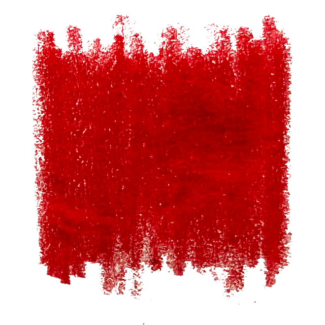
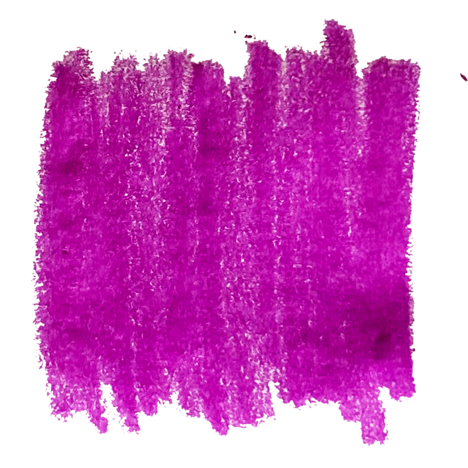
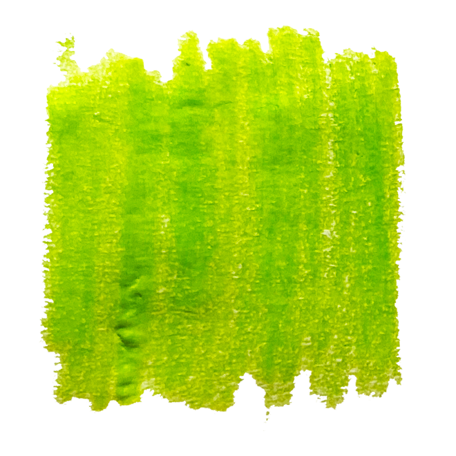
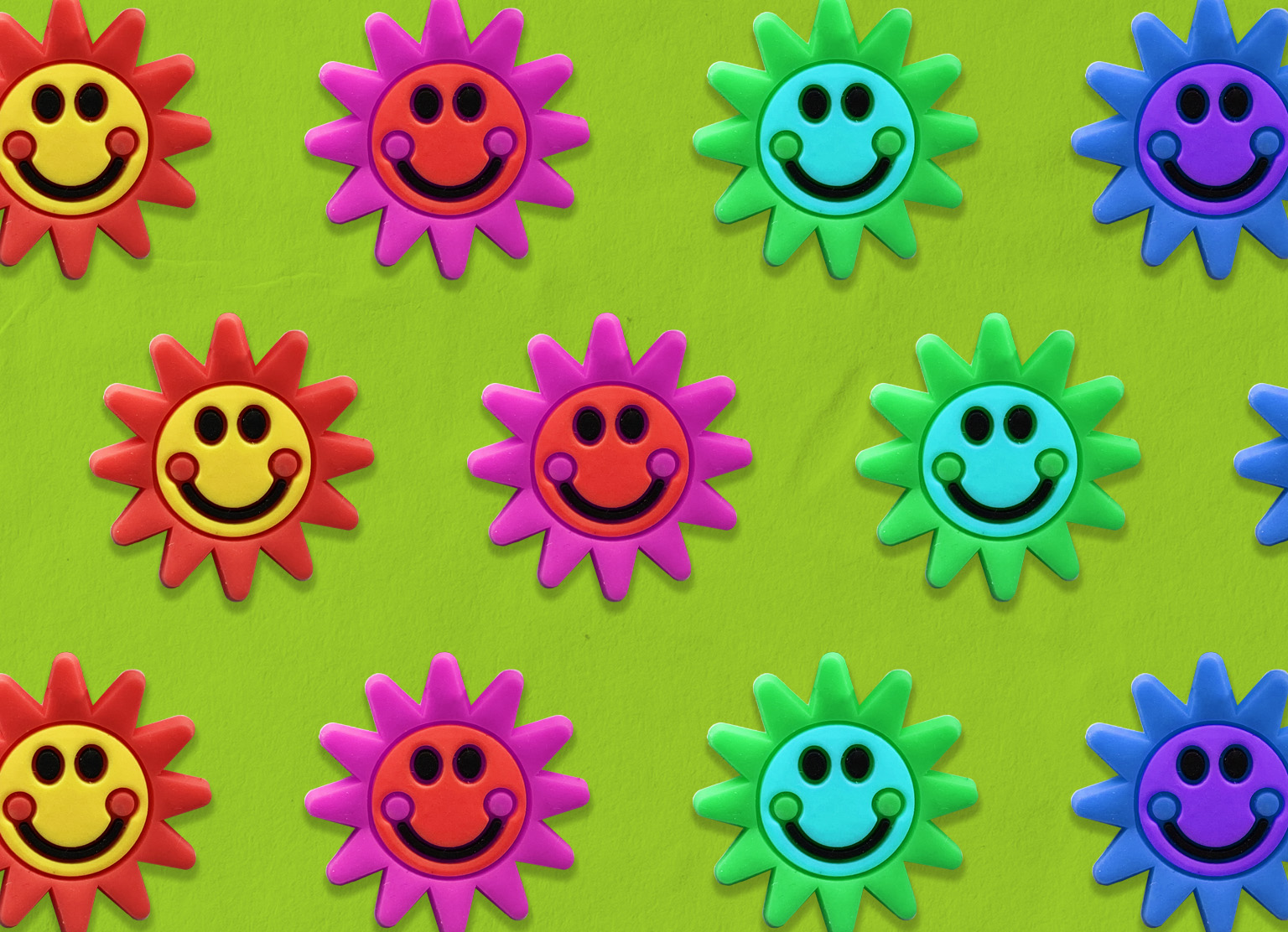
My favourite colours are red, magenta and a very neon chartreuse (Fusion’s green!). Red is my power colour—it’s bold, passionate, loud and intense (and if you’ve met me, this makes a lot of sense!). It makes me feel strong and confident. Magenta gives me the same feeling as red, but with a playful twist. Fusion green—well, Fusion’s been a huge part of my life so this colour represents a lot—creativity, fun, friendship etc., etc., etc. It’s an energetic colour that’s boisterous, joyful and makes me smile.